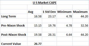
One of the constant thesis I hear about US Markets is that they are way over-valued (and hence should fall anytime soon). This mantra is accompanied by a chart of the long term cyclically adjusted price earnings chart (CAPE), with data from Robert Shiller.
But I wonder, is the long term average really meaningful. The data starts from 1881 (1st data point for CAPE) and for the next 91 years, the currency was pegged (more or less) to Gold. Its been 45 years from the time Nixon de-linked US Dollar from Gold.
If one calculates the Average and Standard Deviations of both those periods, one finds that while based on pure long term CAPE, we are bit above the 1 Standard Deviation, if we were to split the period, we actually end up below the 1 Standard Deviation.
While CAPE more or less peaked out at 27.50 in mid 2007, the average for the period between 2003 and 2007 (Dec) comes to 25.91. Anyone who felt markets were expensive in relation to the historical past would have had to miss the entire rally.
