Notice: Function _load_textdomain_just_in_time was called incorrectly. Translation loading for the restrict-user-access domain was triggered too early. This is usually an indicator for some code in the plugin or theme running too early. Translations should be loaded at the init action or later. Please see Debugging in WordPress for more information. (This message was added in version 6.7.0.) in /home1/portfol1/public_html/wp/wp-includes/functions.php on line 6114

Deprecated: Class Jetpack_Geo_Location is deprecated since version 14.3 with no alternative available. in /home1/portfol1/public_html/wp/wp-includes/functions.php on line 6114

Deprecated: preg_split(): Passing null to parameter #3 ($limit) of type int is deprecated in /home1/portfol1/public_html/wp/wp-content/plugins/add-meta-tags/metadata/amt_basic.php on line 118
Sensex | Portfolio Yoga

Blood on the Streets?

Today was a record breaking day in many aspects. The opening gap down for instance, we last saw something bigger way back in 2007. The net change for the day was a 3.5 standard deviation of daily returns, something we last saw in 2008. Not a single Nifty stock ended in positive territory, not even defensive stocks which got hit (though compared to the battering many other stocks got, this was more of a slap on the wrist).

We can slice and dice data in many ways, but what it won’t tell us is whether the fall is a sign of a long term bottom being formed (panic bottoms are generally ones that aren’t easily broken) or this is just the start on what could be a long journey into the dark world of bears.

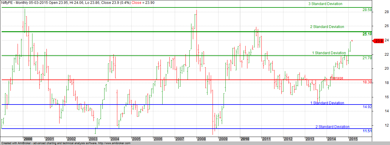
To being with, lets look at two fundamental based charts. PE charts of Nifty and CNX 500. The key reason for looking at these charts is to understand where are in relation to the past.

CNX500 NiftyPE


Lets first start off with the broader CNX 500 PE chart. While today’s fall has meant it broke down below the 2nd Standard Deviation, the fact is that even today, CNX 500 is very expensive. While there maybe pockets of value, on the whole though, market seem to be on the expensive side and since there is vast amount of evidence that buying a stock when its expensive is as bad as buying a bad stock, its tough to lay out whether we should jump in after today’s fall.

Since the PE ratio also accounts for results of the June quarter, the next trigger can only be in September if companies come up with splendid numbers. But with GDP growth slowing down, its a question as to whether companies can actually match market expectations.

On the other hand, while Nifty going by its PE is not as expensive as CNX 500, its not in the area of cheapness either and this creates a dichotomy in a way. Can mid caps correct without there being a impact on the large caps? While Nifty PE moved below the 1 Standard Deviation thanks to today’s fall, its not exactly in a area of cheapness.

After the Modi victory, markets realigned themselves with the hope that with strong growth, even if a company is over valued in today’s terms, they shall get back to normal by way of better earnings. Unfortunately, anyone who has kept a eye on earnings has been disappointed by the lack of growth in majority of companies.

In bull markets,, all kinds of reasons of why a company is not growing gets accepted without much damage to the price, but once markets starts hitting a trough, every company gets its growth put under a microscope to determine whether there is really stuff out there. We are currently at one such stage.

Today’s fall has created a lot of interest as to whether we are seeing a situation similar to what we saw in 2008. While one can only be sure in hindsight, I am pretty confident and shall stick out my neck to say that this ain’t 2008 repeat. But then again, while we remember 20058 thanks to recency bias, what worries me is whether this is a action replay of what happened in 1997 Asean Crisis.

While Indian markets were not as exposed to the world events in 1997 as it is today, by the time the bottom was made, Sensex was 31% below its 52 Week high. Even accounting for today’s fall, we are just 13.6% from our 52 Week high.

Just like in 1997 when most countries were not sure of what was happening in the Asean countries, similar is the situation today with respect to China. The opaqueness of the situation creates a scare that is larger than what may actually be the true picture.

Sensex hit a 52 week low today and while that may seem damming, its a good thing since historically, the first low after a series of highs has never continued without there being a strong bounce back to scare off even the strongest bears.

While FII’s sold heavily in the market and hence maybe in a way accelerating the decline, purely based on how the Rupee has behaved against the Dollar, I believe that India is still relatively unscathed with depreciation not amounting to much (which in other words suggests that while FII’s maybe selling, they aren’t taking out money from India).

But having said all that, I continue to believe that there is no reason to be aggressively long in this market.  My own Assset Allocation meter suggests just 55% exposure to equities. As a saying goes, while the early bird gets the worm, the second rat gets the cheese. Regardless of today’s fall, I continue to believe that Risk Reward wise, we aren’t in a stage where markets are a blind buy.

Yes, Analysts may talk about how selective stocks / sectors are performing better, but unless you believe that you can identify them in advance, the best thing to do will be stay on the sidelines with cash ready to deploy.

They say, Patience is a virtue and for a investor, its important to be aligned correctly since the short term (1 – 3 year) returns are dictated by when you enter. At today’s PE, the 1 year forward growth is still an average 5% but at 19, this moves to 11% which given the circumstances will be a very good return if that gets achieved.

The following table should provide you with perspective on what to expect (based on historical averages) if you were to buy at X times earnings on Nifty

PE

To conclude, if your allocation to equities is below 50%, now is the time to enhance upto a max of 60%. If you are already there, it could be profitable to wait for the dust to settle before diving in.


Building for Rent

Recently I was at a housewarming ceremony of a friend of mine. The said friend of mine had been holding the plot for sometime now and decided that the best way forward was to build a few houses and let it out for rent. This he said gave him the best possible return for his money compared to investing in a fixed deposit or stocks with his assets providing him a regular income which keeps raising year on year.

While in theory, that sounded perfectly fine, I wondered (as I do when people make statements with too many assumptions and without any data to back them up) as to whether that is really true.

The cost of construction came to 7 Million and the friend of mine was anticipating a rent of around 40,000 per month which comes to a rental yield of around 6.85% (pre-tax) on his investment excluding the amount that was spent on acquiring the said site. This seems like a very good number indeed, but how would this compare to investing the same amount of money in the market.

While I come across persons who are happy to invest big money onto properties at one go (after all, you cannot acquire a plot by way of Investing Systematically month on month, can you 🙂 ), when it comes to the market, they find themselves scared enough to risk only a small amount, something even if invested in a very good stock can become meaningless over time.

While its true that risk in markets are high, the same is the case for any other investment save for investing in a fixed deposit. But then again, with fixed deposits not even beating inflation, its not exactly a wealth generator, especially for the younger generation who are and should take more risks in an attempt to build a better nest egg.

First off, here is the matrix of Capital growth using only Rent (which rises 5% year on year). Tax has been assumed to be 15% . While there will be other costs (Taxes, Repairs, Broker Fee, etc), all those have been excluded to make the assumptions simple. Also I have added Interest (on previous years Rent + Accured) at 6% p.a  All in all, the end amount is the minimum (not the maximum) one will definitely be able to save / gain from the house.

Rent

Our final number comes to a impressive 12.20 Million at the end of 15 years. Definitely not a number to be scoffed at though if we were to apply a higher tax percentage, it can drop quite a bit. If tax percentage is 25%, the final number comes to just above the 10 Million mark.

Now, lets move to the other way of investing those funds – the stock market.

Theoretically there are two ways – One invest in a few bluechip stocks and hold on to them or to invest in a set of mutual funds and hope they either meet or beat the market indices. And then there is the third way, investing into a Exchange traded fund that tracks the Primary Index – in our case Nifty or the Sensex.

Direct investing in stocks can be pretty risky or a pretty awesome move with the final result being dependent on what we bought in the first place. Blue chip  companies of the 1970 & 1980’s are not the blue chip companies of today (though a few do remain). Also, its generally scary to plough all the life savings into a few stocks and hope they shall click, and click big.

While its more simple in the world of Mutual funds, even there the risk remains that the fund you chose may actually turn out to be a bad choice. In 1996, you could have invested in funds like Kothari Templeton Prima / Prima Plus as also invested into funds like CRB Mutual Fund. Its only in hindsight that we know which fund delivered and which did not.

While its true that some mutual funds have delivered better results than the Sensex, I doubt if any one can tell the fund that shall BEAT market returns over the next 15 years. The easier option is to just invest into the ETF’s that track the Index and hope that the India growth story shall ensure that we garner a substantial return over time.

If I was looking at a investment period of 15 years (same as the Rent accumulation), what would be the returns provided by the ETF?

To get a answer, lets look at the historical CAGR returns that Sensex has generated over the last 15 years.

CAGR

The average CAGR return over 15 years has been 14.52% with a maximum of 21.43% and a minimum of 7.31% (the 7.31% being the returns one would have got if one got in Dec 1993 and exited in Dec 2008.

If we were to assume, a CAGR growth of 12%, what would our investment today of 7 Million look like 15 years from now?

MF


If 12 Million was awesome, how about 38 Million 🙂

But, there is a caveat you would say. While it cost 7 Million to build a house today, it would cost a lot more after 15 years and that is a true question indeed. Hence lets look at what would be the cost of construction assuming that construction prices keep moving higher. Assuming that construction costs move by around 6% per Annum, here is the table on what it may cost 15 years from now

Cost

A house that costs 7 Million to construct may cost 16 Million 15 years from now. But even accounting for that, the gap between the returns of the Sensex and Rental Income comes to around 28 Million, definitely not small change.

While one may argue that market returns are not smooth, one also needs to understand the various hassles that come with renting a property. And the above returns assume that one had the property for rent for the whole 15 years. What if one did not find a suitable tenant for a few years? How much of a impact it will have on final returns?

While FAR ratio in Indian Cities are pretty low, its bound to go up in the future. Mumbai is already working on a plan where FAR ratio may be anywhere between 0.5 to 8. The FAR ratio for properties around Metro is being increased in cities such as Bangalore and Pune and this additional supply can and would lead to softening of rental returns as we move into the suburbs.

While there can be no Apples to Apples comparison, above analysis does seem to suggest that building a house to rent it out is not exactly the best way to create wealth for ourselves and our future generation.


How often does the Sensex double

Recently when Sensex breached (for a few moments) the 30000 mark on Sensex, Anchors on CNBC-TV18 dressed up with T-Shirts with 30000 printed in bold numbers (and in Red for added effect).

Way back in 2007, with Sensex breaching one round number after another, it was a series of parties in the studios of business channels. But I wonder if television anchors celebrated when Sensex crossed above the 25600 mark.

Whats so important you may ask about the 25.6K mark. Well, it signified the 8th instance of Sensex doubling in price. Below is the table as to when we crossed the mark and how many days it took to achieve it.

The fastest double for the Sensex came in 1990 when it doubled in just 188 days (all calculations are on calendar days and not trading days). The slowest on the other hand took all of 4656 days (translating into 12.75 years).

Average time taken by Sensex to double is around 4.5 years. 51200 is the next double number & I do wonder if we shall scale that peak by 2020

Sensex

Comparing PE Ratio of Sensex & Nifty

For a long time, we looked at only one Index when it came to the Indian Markets and that was the Sensex. Even years after Nifty had come into the picture, Sensex reigned supreme. While Bombay Stock Exchange is the oldest exchange in Asia, when it came to the Sensex, the whole concept is fairly recent  having been first compiled in 1986, more than 110 years after it was founded.

But with derivative trading in Nifty taking precedence, Nifty is the key Index most participants look at. While we have seen Sensex too becoming available for trade, the first mover advantage has meant that Nifty has virtually steam rolled over it.

When it comes to analyzing how expensive or cheap the markets have been, I have most of the time stuck to Nifty since NSE has made the download free and easy. But today I decided to update my Sensex PE and the variation was very interesting to say the least.

First out, here is the updated Nifty Price Earnings (trailing 4 Quarters, Standalone) chart with long term average and standard deviations

Nifty

NSE provides data from 1999 and the calculation suggests that we are closing on to the peak valuation of 2010.

Theoretically speaking, the Sensex PE should show a similar number despite the fact that it has lower number of stocks compared to Nifty. But Sensex Price Earnings number seems to suggest that the market is not all that expensive. A caveat here, While I downloaded the Sensex Price Earnings number from its website, I could not gather as to whether the same is based on Consolidated numbers or Standalone and that in itself can make a difference.

Sensex

What is interesting is that sector weights aren’t too different from each other. Below is the sector weight charts for both Nifty and Sensex.

Nifty Sensex

As you can see, the difference in weights is not so much as to impact the net valuation on a big time.

To better understand the moves of Sensex PE Ratio and Nifty PE Ratio, here is the chart of them combined (Relative Comparison)

Nifty

One of the things that is straight away visible is that while they have more or less moved in sync in the past, this time around, Nifty PE Ratio has shot up more substantially than that of Sensex.

And here is a Relative Comparison chart of Nifty & Sensex

Nifyt

And finally, a ratio chart where I divide Sensex with CNX Nifty

Nifty

What the above chart shows is the points Sensex moves for every point on Nifty. Since 2001, this has been in a broad range.

Personally, I would stick with the NSE Price Earnings Ratio but it would be interesting to know why we are seeing this sudden difference in the Price Earnings of Sensex vs Nifty. The difference lies in a few company results, but it would be interesting to know which of them have actually caused this action.

Budget & its implications on Markets

Since long Budget day has been seen as one the The most important trading days in the history of the stock markets. So much so that regardless of whether its been a week day or not (Saturday as Budget day falls this year for instance), markets have remained opened during the time.

Budget day trading is a Speculator’s delight. Huge swings can be seen in stocks based on how the market perceives what the finance minister just spoke. The reactions are instantaneous when one perceives the huge benefit for the huge disadvantage that comes up due to the addition or removal of some duty.

It used to be a Carnival like atmosphere in most brokerage houses until recently  as the wild movements accompanied by ecstatic trading meant that regardless of whether you made money or lost or were just a bystander who had come to witness the event.

Before 2000, Budgets used to be presented in the evening based on the legacy we carried from the time of the British (a subsidary company cannot present its accounts before the holding company na:) ), Budgets used to be presented at 5 in the evening and while markets closed once the Budget got over, the next day was open regardless of the fact as to whether it was a Weekday or a Weekend (Sundays including).

Since Sensex data goes back only so much, I have been able to Analyze the Budget day movements from 1981 onwards. The data provides for some interesting insights.

There are basically two types of Budgets. The full budget (like this time) which is generally presented on the last day of February and has the accounts for the whole upcoming year. We also have what is known as the Interim Budget in years where there is a scheduled election. Dates of those are not the same and as can be seen in the data below, is pretty varied. While the first Interim Budget is really Interim in nature, I have treated even the full budget that follows that as Interim since it comes generally in the mid of the year and hence not exactly comparable to the full budget that is presented in Feb.

So, lets first look at the data of how markets moved in the day prior to the Budget, the day of the Budget and the days following that (click on the pic to expand)

Budget 2 Budget 1

The YoY percentage number refers to the return generated by Sensex from the date of the Budget to the next and its here that I notice something interesting. The full budgets are better off for the markets (in a positive way) compared to the Interim.

Budget 1

Of course, the whole variation maybe just because of sample size, but something for the bulls 🙂

But even more interesting is the impact of Budget day on the future.

Scenario 1 deals with Impact on markets if markets closed positive or negative on the day of the Budget.

Budget 1

If markets end the day of the Budget in positive territory, there is a very high probability that the trend shall continue to dominate for the upcoming week as well and if they end in negative, again high probability of the trend continuing. Also included in above data is how markets had behaved going into such days. Not much of a difference can be seen which leads one to believe that budget numbers were sacrosanct and markets were genuinely surprised or disappointed.

How about for the year ahead you may ask and here is the data for the same

Budget 1

As you can see, the probability of markets continuing to move in the same direction as one based on just what it did on Budget day extends to the forthcoming year as well.

As much as we would like to believe that Budget day plays a huge role based on above evidence, there is one thing we are missing and that is how the impact is based on how expensive or cheap the markets were at that point of time. Unlike Sensex data, I have data for Sensex Price Earnings going back to only 1991 and that is the time from which this analysis prepared. Additionally since Sensex Price Earnings ratio has been stopped been given free,, I have shifted to Nifty Price Earnings Ratio from December 2012.

Readers of this blog will remember that I post Nifty Price Earnings ratio with a Mean calculated from the 1st data point to the last. I also compute the standard devation of the said data to provide us with something to compare and constrast current data with. In this case, for the early years, the average is not exactly something that is sacrosanct since it uses very little data but as the years go by, the average really starts to become closer to what we see in recent years. So, without further ado, here is the data split into two pics – one for those years where markets went up and one where the markets went down post budget till the next budget.

Budget 2 Budget 1

The Ends column refers to whether Price Earnings was below the Average on the day of the Budget or above it. In 11 out of the 18 instances that markets had a positive return, PE was below the average. In case of years where markets went down, only in 4 out of the 11 instances were PE below the average.

Currently Nifty Price Earnings Ratio is well above the 1st Standard Deviation on the positive side and that is not a good sign for the forthcoming year  if history is any guide.

The first full budget presented by the last NDA government had the markets all happy as Sensex zoomed up 5.13%. Will this budget create a similar euporia?

January Barometer

I am currently reading the much acclaimed “Stock Trader’s Almanac 2015” and the first major seasonal indicator that comes up for discussion is the January Barometer. Designed by Yale Hirsch in 1972, the January Barometer states that as S&P 500 goes in January so goes the year. The Indicator has been successful 89.1% of the time since 1950.

In India, we are not fortunate to have such large data sets and hence I have had to make do with the Sensex data that I have. Starting from 1982 till 2014, the Sensex has had a record that is pretty close to a coin toss.

In those 33 instances, markets have followed January only 17 times while going against what was seen in January 16 times. In that sense, there is nothing much to take from it. But with January 2015 being +ve, let us see what it can bring in the year ahead.

Of the 16 times January has been positive, the year has ended in positive territory 12 times. That is a nice 70% hit rate. The average gain for the year in such years has been 31.81%.

In the 4 instances where January was +ve and yet the year closed on a negative note, the average loss in those years came to 13.69%

On the other hand, what if January was Negative? We have had 17 such instances and of those, January affect was seen in just 5 years (January negative and Year ending in Negative).

The average gain for the year when January was negative (12 instances) came to a astounding 36.86% whereas the average loss of the year when January was negative (5 instances) came to 23% (a reason for the high loss being 2008 when markets fell 52%. Exclude that and the average drops to 15%).

Since January 2015 ended with gains, right now the higher probability is of markets to close in +ve territory. Then again, this is neither a wholesome trading strategy nor do we have a very high confidence level.

Sensex by Day of the Year

This idea comes from Eddy Elfenbein of Crossing Wall Street fame. He has done a similar analysis on the Dow and I wanted to see what outcome would I find if I apply the same concept to the Sensex (owing to it having a much later history than CNX Nifty).

The Chart below outlines the fact that Sensex has been found range-bound from mid October to early December before we follow the Santaclaus rally that is seen in the US.

Do note since I have averaged around 34 years of data, this has not much of predictive power, but at the same time gives us a visual of how Sensex has moved over the years.

The period from mid March to early October seems to be the time when the markets have been the strongest and trending strongly.

So, without much further ado, here is the Chart 🙂

Sensex

[Click on the chart to enlarge]

Postscript: Data used for the Chart above starts from 01-01-1981 and ends at 28-08-2014