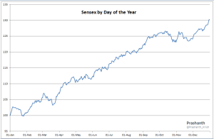
This idea comes from Eddy Elfenbein of Crossing Wall Street fame. He has done a similar analysis on the Dow and I wanted to see what outcome would I find if I apply the same concept to the Sensex (owing to it having a much later history than CNX Nifty).
The Chart below outlines the fact that Sensex has been found range-bound from mid October to early December before we follow the Santaclaus rally that is seen in the US.
Do note since I have averaged around 34 years of data, this has not much of predictive power, but at the same time gives us a visual of how Sensex has moved over the years.
The period from mid March to early October seems to be the time when the markets have been the strongest and trending strongly.
So, without much further ado, here is the Chart 🙂
[Click on the chart to enlarge]
Postscript: Data used for the Chart above starts from 01-01-1981 and ends at 28-08-2014

Hey can you add some details on the chart. What was averaged and how. And why does it begin with 100?
Each point in the bar (there are 365 points representing each day of the year) is based on the average move that has been seen on that day for all the years combined.
So, for example, to calculate the average move of 1st Jan, I have taken the average moves of all 1st Jan (whenever markets are open) from 1981 to 2014 and then plotted the same.
Starting point could have been anything, used 100 instead of using any other number for no special reason.