A adage in the market says that Stocks take an escalator up, and an elevator down and in this environment with Nifty falling like nine pins day in and day out, one actually wonders if it has taken the elevator or has actually fallen through the elevator shaft.
While till recently the mood of the market wasn’t bearish, the last time we saw a new high was way back on 3rd March and a month from now, we would have passed a year without being any closer to the same (unless of course the market decides to make up for all the mistakes in double time and make a new high before that).
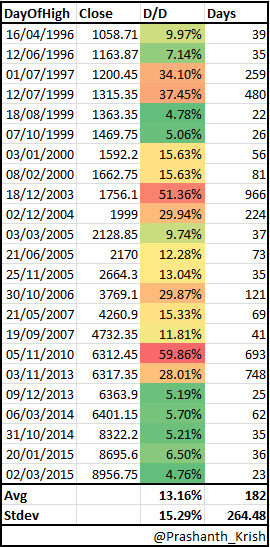
But, historically what has been the duration of time spent between two highs and more importantly in light of the fact that we are now down 18.75% from the high point, what is the average draw-down one encounters.
When markets are hitting new highs, there is generally some amount of continuation and to avoid small number bias, I have reduced the number of highs to those that occur at least 1 month after a previous high. In other words, if markets hit a new high 3 times in the month, I ignore the 2nd and 3rd high and take for my calculation only the first.
But to calculate the draw-down and number of days spent, I use the 3rd high so as to ensure that only the draw down seen after the last high to the next high gets measured.

What’s D/D? Does color in that column signify anything, please elaborate.. Thanks..
D/D = Draw down from Peak (Close to Close)
Color is just showcasing the lowest (Green) falls to Worst (Red) 🙂